
Case Study
Arcadia Sports Triad – Brand Identity
I developed the visual identity for esports organiser Arcadia and its league, the Sports Triad. My work covered the brand mark, the design guidelines, a Rocket League in-game overlay and the web app the production team uses to control it.
- My Role
- Design Direction Control Hub UI
- Team
- Christoph (opens in a new tab)Tobias Wallisch
- Context
- Client project
Challenge
A new esports format needs
a style of its own.
The Arcadia Sports Triad brings together three sports titles: Rocket League, F1 and EA FC. All teams compete in a single shared table, so winning the season requires strong results in all three disciplines. Franchises help shape the league, for example by weighing in on rule changes. The identity had to stay broad and instantly recognisable while keeping the format's distinct character, and convey competition, modernity, health and sport.
Concept
A triangle and a star merge into a single brand mark for Arcadia. Three columns and three stars form the crest of the Sports Triad, one for each discipline. Dark Lemon Lime, Eerie Black and Platinum create a look between sports field and tech that bridges traditional sport and esports.
In detail
01Research
Starting point
The Arcadia Sports Triad brings together three sports titles: Rocket League, F1 and EA FC. All teams compete in a single shared table, so winning the season requires strong results in all three disciplines. Franchises help shape the league, for example by weighing in on rule changes.
Challenge
A new esports format needs a style of its own. It had to stay broad and instantly recognisable while keeping the format’s distinct character. The identity also needed to convey competition, modernity, health and sport.
Analysis
I analysed existing esports organisers, drawing on experience from earlier work with tournament organisers. I then explored how shapes, colours and structures affect perception.
Ideation
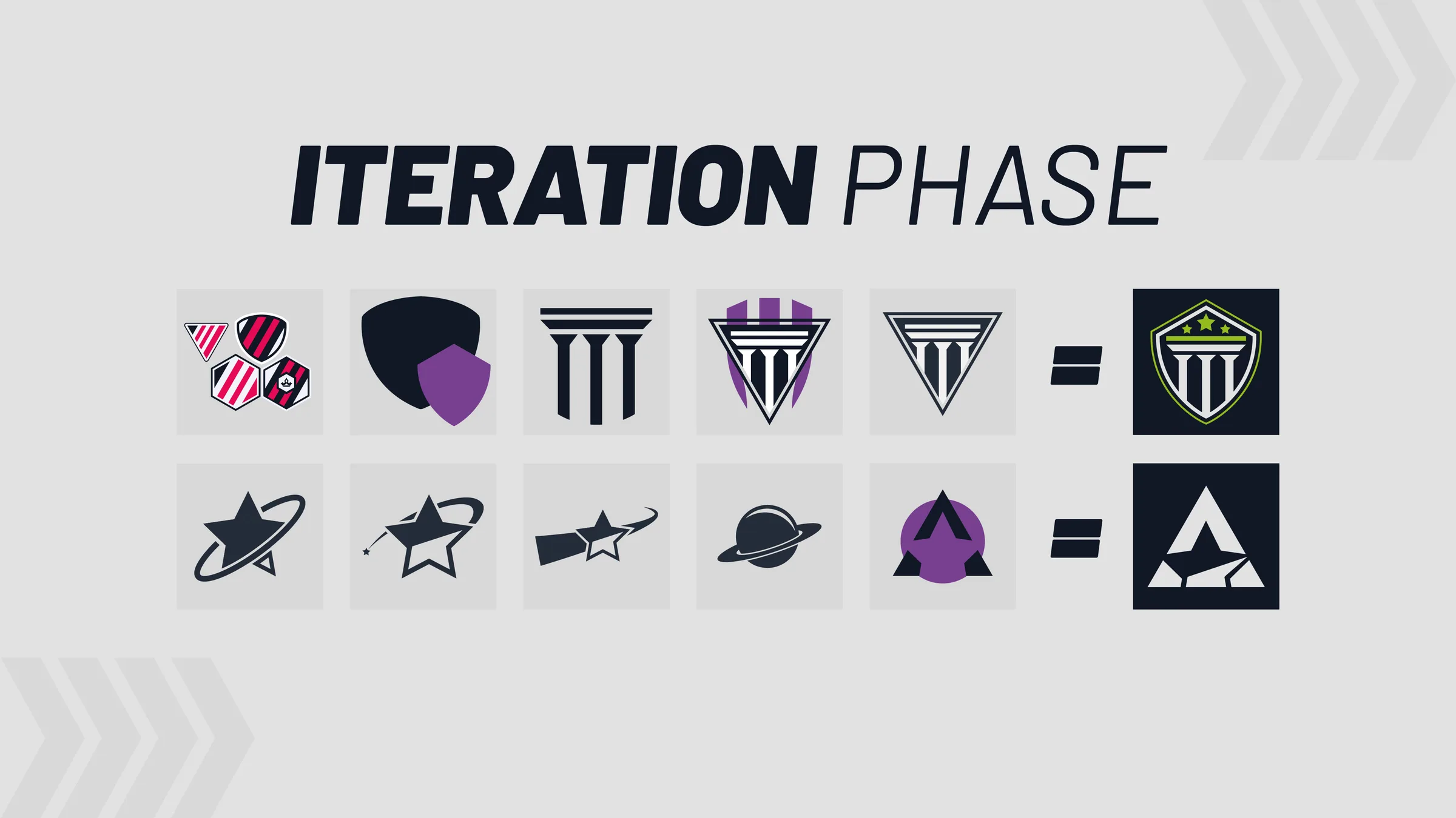
I started with open brainstorming across every direction: bold, plain, wild and chaotic. This gave me a broad overview of possible routes. I developed two of them further, one into the Arcadia brand mark and one into the signet for its league.
Arcadia brand mark
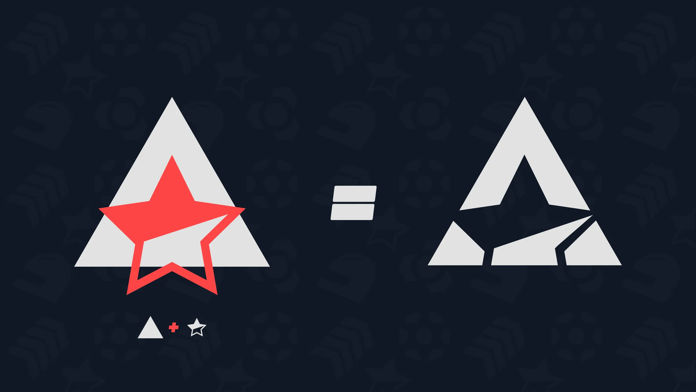
The triangle’s three corners stand for the three disciplines, and the star for the title every team is competing for. The two merge into a single form whose negative space reveals an A, so the mark carries the brand name without needing type.
Sports Triad signet
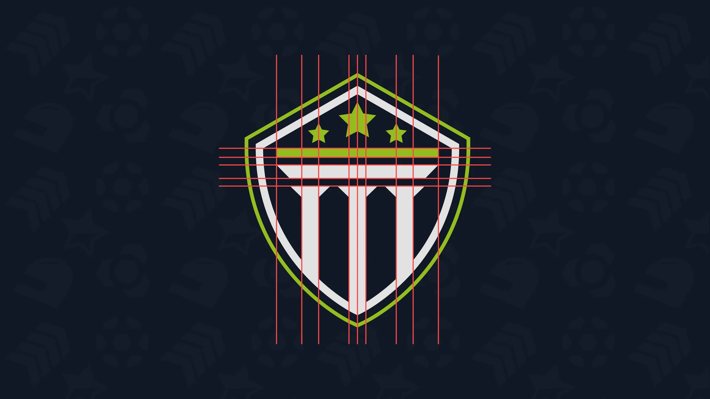
The crest shape draws on the tradition of club badges and roots the league in traditional sport. Three columns and three stars represent the three disciplines. The columns also reference the Greek origin of the name Arcadia, while stars are a familiar symbol for championships in sport. The crest is built on a fixed grid of spacing and proportions that keeps it balanced.
Colour
Dark Lemon Lime picks up the pitch green shared by Rocket League, EA FC and motorsport. Paired with Eerie Black and Platinum, it creates a look between sports field and tech that bridges traditional sport and esports. Light Platinum provides a calm base that lets the lime work as an accent. A 70 / 20 / 10 ratio keeps this balance consistent across every graphic.
Typography
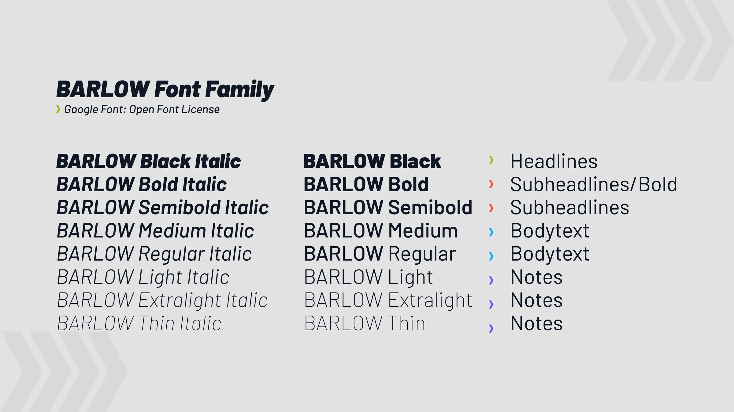
Barlow is a Google Font under an open licence, so every franchise can use it free of charge. The family covers weights from Thin to Black, each with an italic. Italic headlines add movement to layouts and match the identity’s sporty character.
Logo system
The system has three variants. The combined word and figurative mark is the primary logo. The signet works where space is tight, and a co-branded version shows organiser and league together. Clear space is derived from the proportions of the marks themselves, so it scales with every size. Logos are supplied as finished files, so no one has to rebuild them and the proportions stay intact.
The logo with word mark and crest, with construction lines showing the proportions x and y. Clear space of the three logo variants: word and figurative mark, co-branded mark and signet. Design guidelines
Because franchises help shape the league, they also needed to be able to create their own on-brand assets. The guidelines define colour, typography and logo use. Arrows, edges and lines form the graphic elements. The arrows convey movement and direction. Each element follows clear rules for colour and use while leaving room for variation, such as the size and number of arrows.
The colour palette of the Arcadia brand. Graphic elements: arrows, edges and lines. Rocket League in-game overlay
Rocket League supports custom HUDs. The key requirement was making a large amount of information readable at a glance. I kept the established layout conventions, so viewers familiar with other Rocket League broadcasts can orient themselves instantly. This also gave me room to push the visual design. Team colours come from the secondary palette, with Sunburst Cyclops for orange and Skobeloff for blue. This preserves the in-game colour coding while keeping the overlay on brand. The overlay includes a scorebug, overtime state, boost meters, player card and replay bar.
All overlay elements at a glance: scorebug in normal and overtime state, player lists, boost displays, player cards and replay bars for both teams. Rocket League overlay in play with scorebug and boost display. Rocket League overlay during a replay with scorer and assistant. Rocket League overlay with the player card during play. Rocket League overlay in overtime. Control Hub
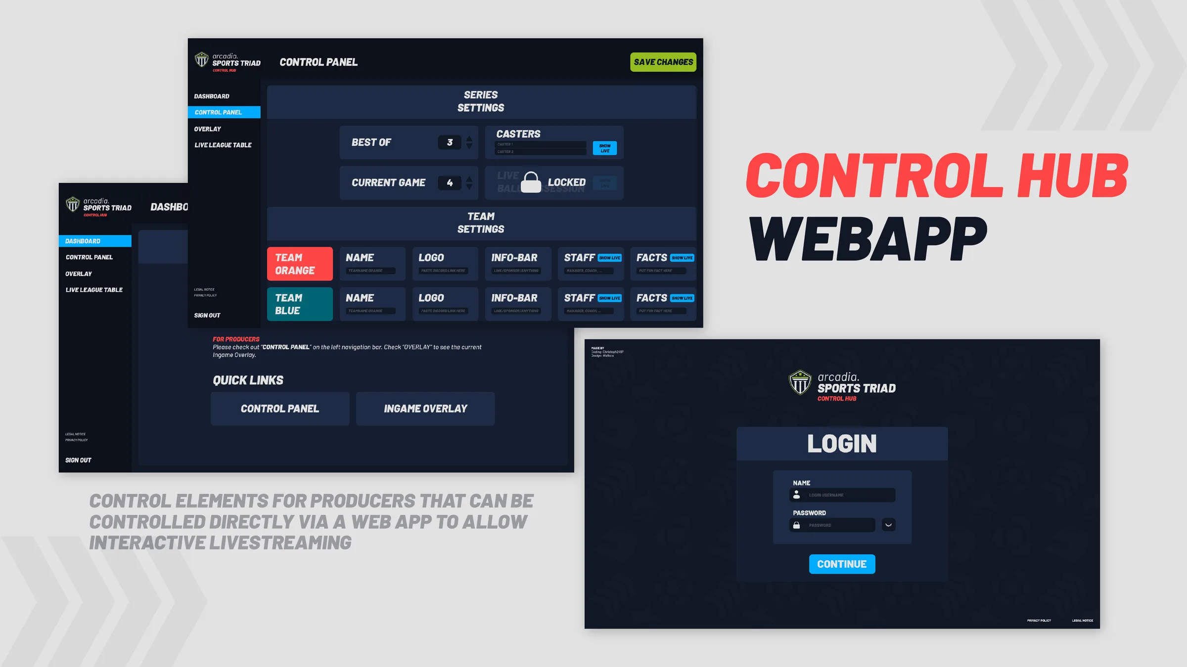
A web app lets the production team control the overlay’s interactive elements, including series and team settings as well as content that can be switched live. This keeps data up to date during a broadcast. The interface follows the brand’s look and is organised by task: dashboard, control panel, overlay preview and league table. I designed the interface. Christoph handled development.
02Outcome
What remains
The league never launched. Investors withdrew, and acquisition talks with a larger esports company fell through due to developments on their side. As a result, the overlay and Control Hub were never used. HUDs for F1 and EA FC had not yet been started.
What remains is a brand system for both organiser and league, guidelines for everyone working with the brand, and a complete overlay with its control interface.
“Tobi stood out not only through the quality of his work, but also his maturity and leadership skills. He was clearly passionate about the work he did, with great attention to detail, a continuous-learning attitude, and a collaborative approach with wider project teams. He also had fantastic time-management, working to tight deadlines and regularly offering updates and expected timescales. All of these qualities combined created realistic targets and then a fantastic end result.”
Jez Founder of Arcadia