
Case Study
RSC – A brand refresh that puts a community league on par with the major leagues
A brand refresh for the largest European Rocket League community league and its sister leagues. From the logo and tier icons to the broadcast overlay and the recurring formats of everyday league life.
- My Role
- Solo Project management, concept and design
- Client
- Rocket Soccar Confederation (RSC)
- Context
- Client project
- Duration
- 1-month core phase then ongoing
Problem Statement
The league is more professional than its appearance suggests.
Behind 33 seasons and over eight thousand players stands a brand identity that does not scale across its touchpoints: on mobile devices it becomes unreadable, and it comes across as slower than the league is. At the same time, it is exactly what carries brand recognition within the community.
33
Seasons completed
8,800
Players signed up
20+
Active franchises
$25K+
Prize money paid out
Guiding question
“How does an esports league become more athletic, more modern and more marketable without losing its identity?”
Concept
The brand keeps everything the community recognises it by, and loses everything that makes it slow. Instead of redrawing, I reduced the existing mark to its core and rebuilt the system starting from the smallest application.
In detail
01Research
Proposal & positioning
I approached the league with a proposal after noticing the gap between its organisation and its appearance.
I have been part of the Rocket League and esports ecosystem myself for almost a decade. That gave me a starting point, but not a complete picture: those who play in, watch or organise the league bring very different expectations. I therefore treated my own view as an assumption and checked it against two sources: a systematic comparison with other formats and feedback from the league leadership and admin team.
Competition
On a coordinate system, I placed the league against other formats in the scene, from the official top league and commercial tournament series to comparable community leagues. The league reached a young audience, but its appearance barely extended beyond its own community, and it came across as slower and less competitive than it is. That gave the direction: more athletic, more modern, faster.
Coordinate system with Rocket League and esports formats. The vertical axis runs from community-led (bottom) to agency, association or college (top), the horizontal axis from recreational sport (left) to entertainment and market appeal (right). RSC sits at the bottom left among the community leagues, an arrow points to the right towards the target position "RSC (after)". Slide “Design Principles” with three principles: #1 Sporting – clean lines, a clear hierarchy, works even on the smallest screen. #2 Distinctive – recognisable straight away on Discord, Twitch and social media, even without a logo. #3 Community-driven – the stage belongs to everyone, not just the top players. Design principles
From the comparison and the feedback, I derived three principles. Sporting: clean lines and a hierarchy that holds up even at small sizes. This led to the crest and the overlay. Distinctive: recognisable even without a logo. That is why the colours and typeface stay. Community-driven: the stage belongs to everyone. That is why the tier icons of every division are designed as equals.
02Decisions
Paths I discarded
My drafts mainly varied the shape that carries the mark: the previous hexagon, a free-standing wordmark and a crest. The crest won out. Its point picks up the direction of the chevron, both converge downwards in parallel, and as the classic shape of sports badges it moves the league closer to sport. The mark stays recognisable through what the community associates with it most strongly: the RSC wordmark and the red-and-blue chevron.
Inside, I removed everything that does not carry its weight: stripes, a banner and a symbol that no longer described the league's current structures correctly and broke the symmetry. A logo may carry historical layers, but not ones that misrepresent the present.
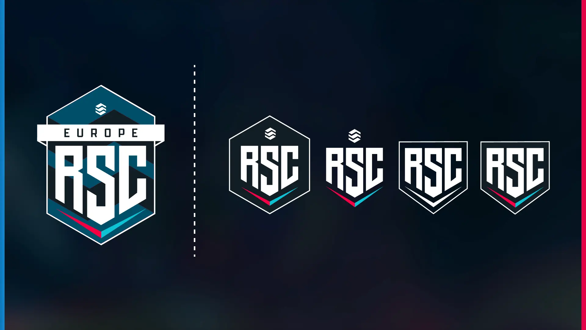
The previous logo and the design directions up to the crest. One mark for all leagues
The sister leagues share the mark and differ through the wordmark, the league for the second game mode through the colour of the game. The region name sits above the crest instead of in a banner inside it. The crest itself is identical across all leagues and works without the name in small applications.
Tier icons: many variants, one order
For the tier icons, I developed the most variants and selected from them together with the league leadership on a board where every variant sat with its rationale. The colours were left untouched, even though their order is not logically structured. A sequence from green for entry level to violet for excellence would be coherent, but the colours are the fastest orientation anchor in everyday league life. A refresh that shifts meanings at the same time would have created confusion where clarity was needed.
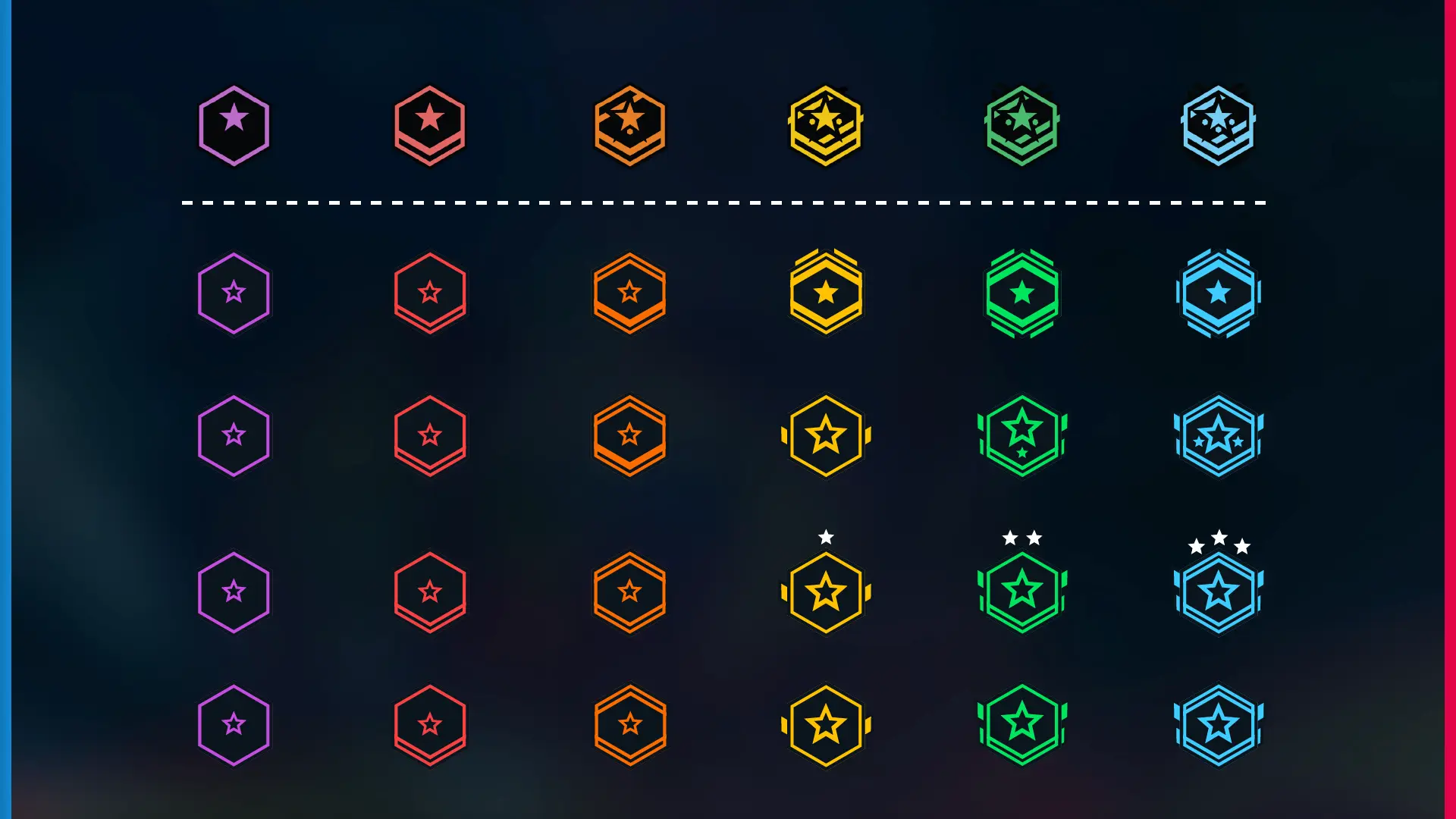
Tier icons from the previous version (top) through the rows of drafts. 03Solution
How the system works
Every element is designed starting from its smallest application. The logo works in a single form, from the Discord icon to the stream banner, and needs no separate versions for small sizes. Full-colour and single-colour versions adapt it to different backgrounds; the form stays the same. The tier icons are geometrically simplified and stronger in colour so they stay distinguishable in every context of a division.
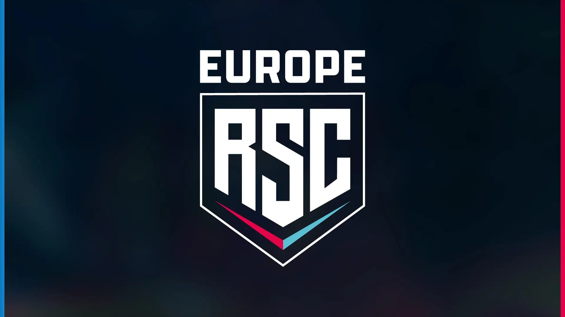
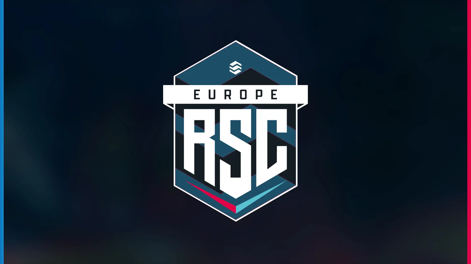
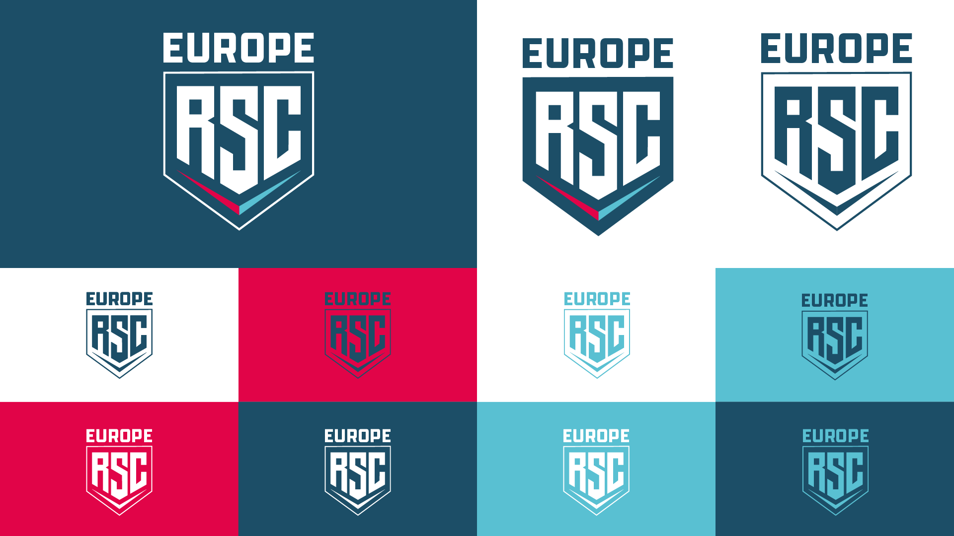
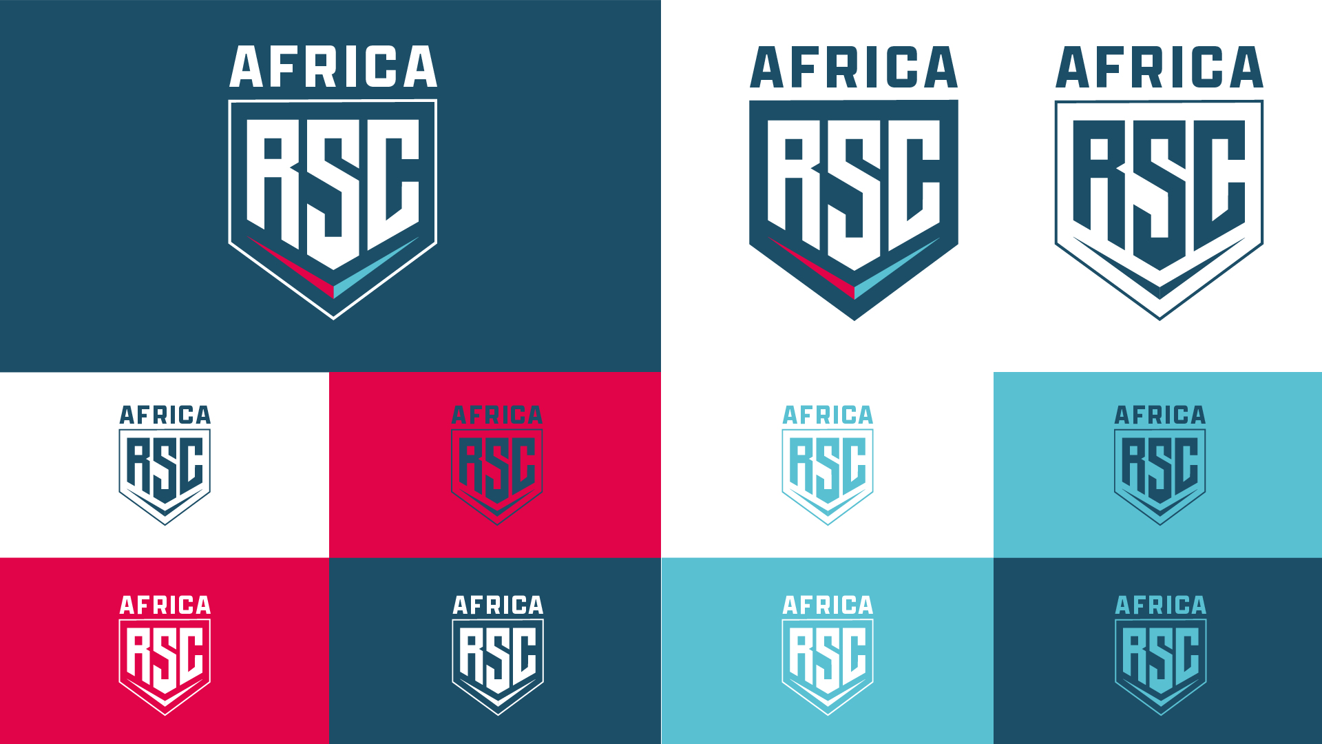
The logo before and after. Below, RSC Europe and RSC Africa: one mark for several leagues that differ only in the wordmark. Colour & typeface
The colours and the house typeface Apotek stay, because the community recognises the league by them. The only addition is a second blue for the blue team in the overlay, so both teams are clearly distinguishable in the broadcast without displacing the brand colour.
The brand colours as colour strips with hex values: Red (Munsell) #f50043 (changed, the old red is marked as a darker bar), Mystic Sea #59c0d2, Middle Blue #008cdb (new), Japanese Blue #1b3c61 and Amsterdam #062144 (new). The six tier colours as colour strips: Average Magenta, Blaze Red, Hot Orange, Amber, Malachite and Strong Arctic Blue. At the top the old tier icon, at the bottom the new icon in a stronger colour. Overlay: rearranged for the vertical clip
The overlay is rebuilt completely, with a new logic for where information sits. The boost display, usually at the bottom right in Rocket League overlays, now sits in the centre. This keeps all match-critical information in the vertical crop, and clips work without post-editing. A second blue for the blue team makes sure both teams are clearly distinguishable in the broadcast without displacing the brand colour.
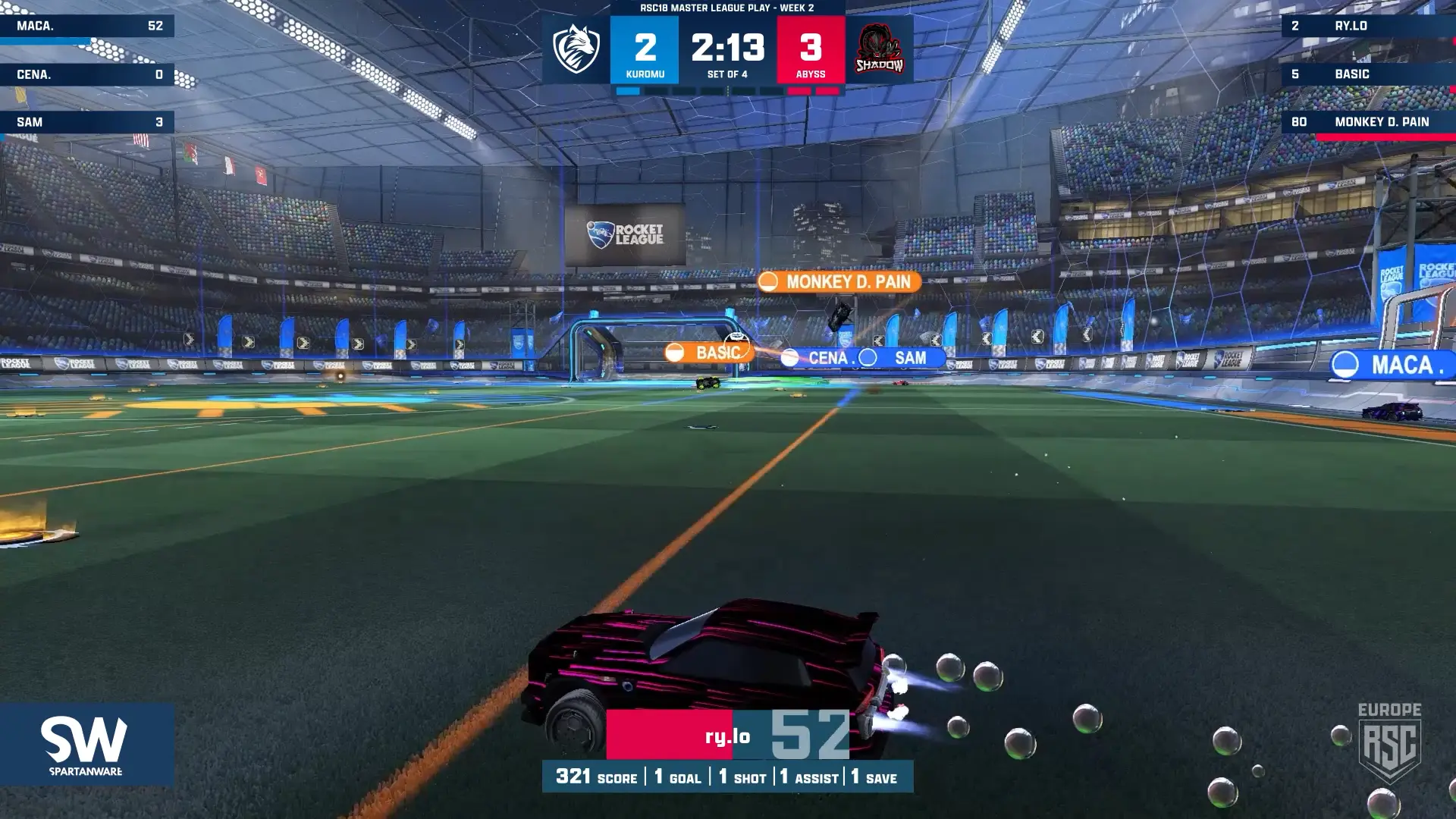
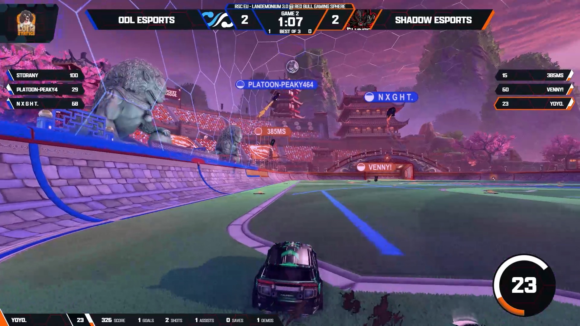
Overlay before and after: the boost display now sits in the centre and so stays in the vertical crop. Drag the handle to compare. In everyday league life
A league shows itself in its logo and, week after week, in recurring formats. The system therefore carries through all of everyday league life: from Team and Player of the Week to talent predictions, winner graphics, awards, staff graphics, Discord and Twitch. All formats follow the same hierarchy, so they are recognisable as RSC straight away in the feed and on stream.
Caster cam overlay: two webcam feeds side by side, each with name, team (Catalyst) and score in red bars below it, and a “Who will win?” voting bar at the bottom showing 50 to 50 percent. Head-to-head overlay for the Master Playoffs: the blue team on the left and the red team on the right, each with a car seen from above, statistics in the centre (score, goals, shots, saves, assists, demos and GPAR) and the team bars at the bottom. Match scene with in-game overlay: the RSC Europe casters panel with two names at the top centre and, at the bottom centre, the 2–0 scoreline between Xinjiang (blue) and Catalyst (red) with stadium and “Set of 4”. Stream schedule for Friday 7 August, week 4: three matches between Ankole Watusi and 2orocketeers at 20:00, 21:00 and 22:00 for Academy (purple), Challenger (orange) and Elite (green). “Players of the Week” graphic for the Prospect division: six categories (MVP, Finisher, Striker, Playmaker, Saviour, Demon) with team logo, value and name of the best player plus second and third place. “Team of the Week” graphic: six coloured strips for the divisions Master, Elite, Rival, Challenger, Prospect and Academy, each with a gameplay shot, team name and team logo. Built for handover
The league has its own design team that produces the formats in everyday operations. My goal was therefore a system others can keep working with. I set up the formats as templates and prepared the files so the team can fill them on its own and develop new formats within the same system. The brand book records these rules.
04Result
Rollout & response
On 3 September 2026, the refresh was released together with the announcement video, and logos and banners were replaced across all channels.
“New logo has no business being that clean.”
“Best part of the rebrand is the overlay. Can’t wait to play a series under it.”
“They’re (the league) really trying to get us out of retirement.”
“Tobi is an approachable media designer who structures projects clearly and understands clients' needs. He meets tight deadlines and contributes valuable input without being preachy.”
Adam Binns Co-Owner RSC EU & Africa 
Learnings
Even a league that looks manageable from the outside has built up a structure over the years that only becomes visible once you touch every application. Which formats the refresh actually covers only emerged along the way, and coordination ran alongside ongoing league operations. On the next project of this kind, I would define from the start how applications that turn up later are captured, prioritised and scheduled.
Outlook
Some of the applications are still to follow. Next comes the brand book, so the league can develop new formats within the system on its own.
0:00 / 0:00